Assignment 4 Report - What Does Christmas Look Like?
Introduction
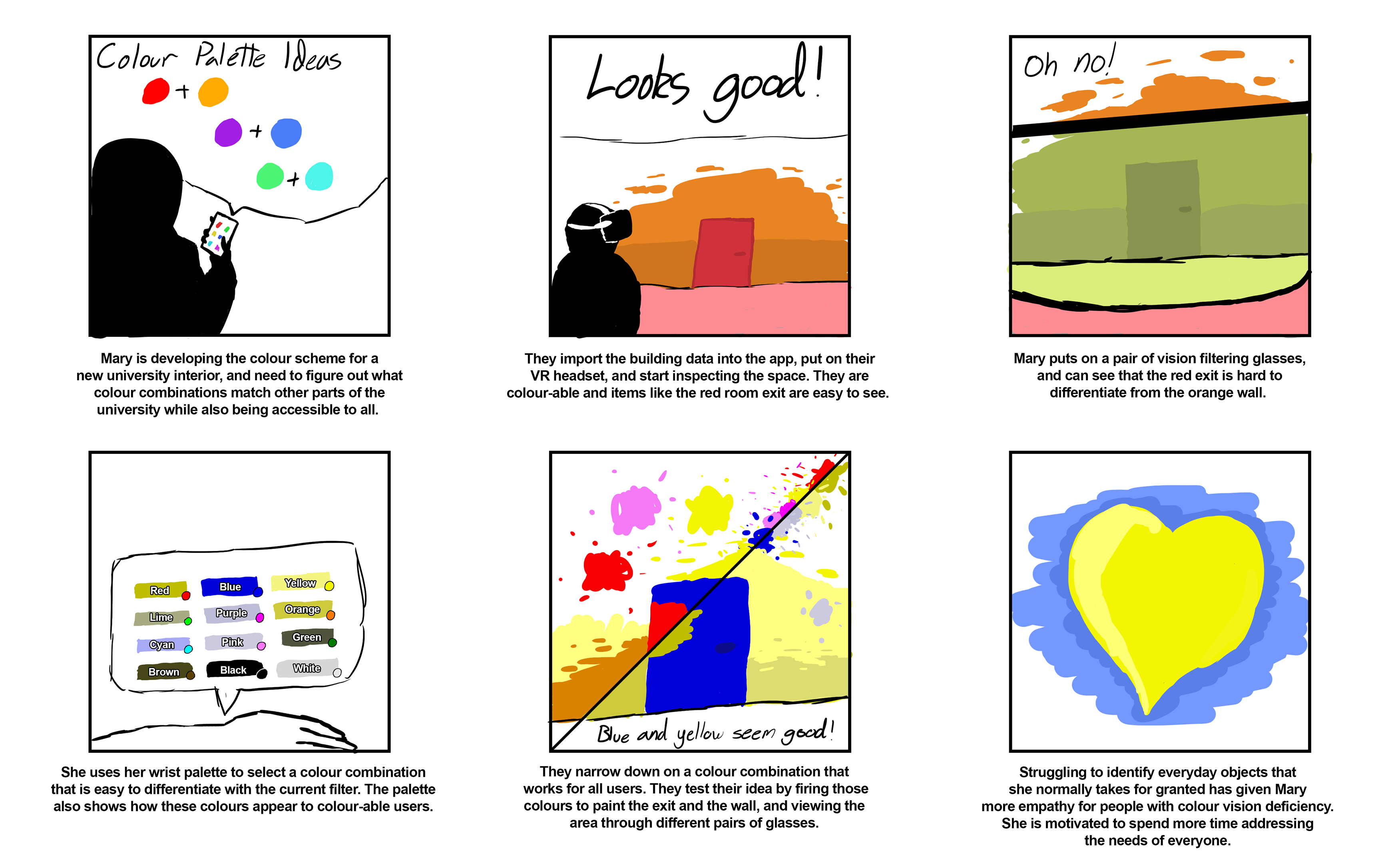
Colour Vision Deficiency (CVD) affects roughly 1 in 12 males and 1 in 200 females (Collinge, 2017). ‘What Does Christmas Look Like’ (WDCLL) is a virtual reality (VR) application that allows colour-able designers to experience the effects of different kinds of CVD, and recolour the virtual environment to best suit a wide range of colour-able and colour deficient people.
Application Description
The designer begins by loading the environment they wish to view into the application, before entering the virtual environment by putting on their VR headset. The digital scene initially appears identical to how it would look to them in the real world. The designer may then put on a range of virtual glasses, with each pair changing the colours of the scene to match a particular form of CVD. Once a new colour is chosen from a wrist mounted palette, the designer can change the colours of objects in the scene by firing paint from their hand.
Colour is used as a design tool to contrast objects, attract attention (for example by highlighting an object in a visual search), assign meaning (such as using coloured jackets to indicate flight crew roles), and for aesthetic congruence (for example, where colour is used to reflect the mood of a presentation) (Chaparro, 2016). Given this wide usage, it should come as no surprise that the use of colour in the design of widely used spaces and objects can cause major issues for sufferers of CVD (Fickett, 2022). With this broad context in mind, we decided to create an offering that provided a contextual shift away from checking colours (for example by looking at an object using your phone camera), and towards experiencing colours through their use as visual design cues within designed spaces. Why is this emphasis on embodied navigation useful? We suggest that narrowing the conceptual gap between designer and end-user allows for a limited form of usability testing to run parallel to the early design process, hopefully reducing overall cost if early accessibility issues are exposed earlier in the development process. If the usages of colour a many and varied, the designer should be able to test their designs in an equally rich manner.
Interface Solution
We had three interface requirements. Firstly, the application should allow designers to create more accessible spaces by experiencing forms of CVD across the multiple contexts mentioned above. Secondly, as empathy is widely considered to be the necessary first step for user-centred design (Alrubail, 2015), an ideal interface should also help the designer empathise with their end users experience to the extent that they are motivated to address those unique accessibility requirements. Finally, the interface should allow a tight mapping between the real-world space and the digital representation that the designer works with, and interactions within the application should be intuitive to not reduce bandwidth to the brain as the designer makes complex judgements within the space.
Accessibly minded designers should be able to see the world from the perspective of their users and empathise with their lived experience. Preliminary evidence suggests that the greater sense of presence given by VR could lead to “a higher level of two dimensions of empathy, empathic perspective taking and empathic concern (Schutte et.al., 2017)”. This speaks to our first two interface requirements: VR gives a first-hand experience from another’s perspective, but also from a position of empathy that is highly desirable in the design process.
VR was also suitable for creating a tight mapping between the designer’s representation of their design on the one hand, and the embodied experience of navigating that space on the other. From a design perspective this mapping is important – if there is a divide between the digital appearance of the space and the real space, originally sensible design designs may end up being unsuited to the reality of the situation. For a tight mapping we needed to limit on-screen interface elements as much as possible to keep the designer’s view unobstructed, and to have them ‘inside’ the space so that they could experience the effects of height, lighting, movement, and scale on the colour usage within the space. Reducing bandwidth to the brain through intuitive interactions works well within a VR environment where viewing and altering the environment can be performed with human-like movements.
Interaction Design
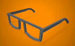
Putting on glasses to switch view mode
Viewing the environment through the eyes of someone with CVD is the core interaction of our application. Our initial interaction design involved selecting a vision mode from a wrist mounted menu wheel, in a similar fashion to the work-in-progress demo video. Ultimately, intuitiveness and novelty prevailed and so we changed tack – now vision modes will be represented by pairs of glasses that are ‘worn’ to change the filter. There are 9 pairs of glasses: one for each major form of colour-blindness. When the glasses for that type of colour-blindness is placed on the designer’s eyes, a post processing effect will alter colours to simulate that form of colour-blindness. The main limitation of this chosen interaction design is that as the post processing effect is tied to the interaction of an object with the player. The player must have the object (glasses) with them to change the view mode and if they don’t have this item on hand, must go and pick it up from where it was last left. We will experiment with methods of reducing the inconvenience of this method. The most likely compromise is that glasses will exist on a platform that is always hovering within arm's reach of the player. When the player swaps glasses, the pair they removed will automatically return to that convenient platform. Our reasoning for mapping the vision filter change to pairs of glasses was that it is already intuitive for people to put on glasses to change their vision, and thus filtering could be accomplished without impeding bandwidth to the brain.
Selecting a colour using the wrist-mounted palette
Colour selection is a necessary feature of our application because the designer must be test different colour combinations in the space. We designed this interaction to allow a designer to recolour the scene in a way that reduced time taken and distance travelled inside the environment. We originally discussed the idea of world space paint pots or palettes that could be interacted with to recolour the scene. We quickly concluded however, in a similar vein to the vision switching mode, that using these pots or palettes would prove too time consuming and tedious to use, as the designer would need to travel to and from the painting object and the part of the scene they wanted to recolour. We opted to attach the palette to the left arm so that it remains accessible. Once the colour is selected with the other hand, a paint ball with the colour selected would appear in the right hand. Looking critically at this choice, the use of a wrist mounted palette is similar to a colour selection panel on a traditional desktop UI – both provide quick access to colours, and both can be hidden and revealed somewhat trivially. While this interaction is necessary and the implementation is simple to use, there could be a more elegant solution that feels even less like a menu, and is thus more intuitive and enjoyable to use.
Firing paintballs to paint objects
The third interaction of our application allows the designer to apply colours to the environment, which is once again a mandatory interaction if the designer is to be able to test different compositions. In the context of a design application, a designer working on a computer can select a distant wall and immediately colour it – we wanted the VR painting experience to have a similar interaction speed, and not require approaching the wall to paint it. On the other hand, we also wanted to leverage the capability of VR to increase bandwidth to the brain by replacing computer-centric design decisions with more intuitive human-like equivalents. In this case, we decided that the paintball could be thrown or fired at objects in order to paint them. We hoped that this method would be more satisfying and enjoyable than virtual pointer system. On the other hand, this method has drawbacks: aiming is now a factor, and incorrect aim will now require that the object be repainted, whereas on a traditional computer application the selection occurs prior to painting, allowing users to realise when they have targeted the wrong object. We may need to implement an ‘undo’ feature to allow users to quickly recover from misfires.
Technical Development
The current build is a simple work-in-progress that allows the user to test different colour filters using a wrist mounted menu, view Ishihara plates in the scene to test the effects of the filters, and recolour objects in the scene by firing paint from their hand. It was tested using Oculus Quest version 1 and 2 headsets, and built using the Unity version 2022.1.7f1.
To simulate colour-blindness, we drew heavily from a guide (www.colorjack.com, 2022) on converting red, green, and blue values in JavaScript to create an equivalent experience to what someone with colour-blindness would experience. The guide included sets of values for many types of colour-blindness. Each set corresponded to one type of CVD. A set of values described how much of each channel should be reapplied to all three channels, and what distributions, leading to 9 values between 0 and 1. These values were then stored in a C# script, that then modifies a shader that is attached to the camera in Unity.
In the short term, the furniture models in our 3D model section will be used to create a more realistic test environment, and filter selection will shift from the wrist mounted menu to the use of virtual glasses.
In a full version of this product, we would like designers to be able to move and instantiate objects in the environment, import entire environments, adjust the materials of objects, and adjust lighting within the scene to test the effect of light and dark on accessibility. Designers must be able to freely import and modify their work for our application to be usable in a real setting – these features constitute the bare minimum for this to move past a tech demo and towards something that brings value to designers.
Descriptions of 3D Models
Glasses: A pair of glasses used for colour filter interactions.
Ishihara Plates: Colour vision test plates used to test the filters an demonstrate common colour combination antipatterns.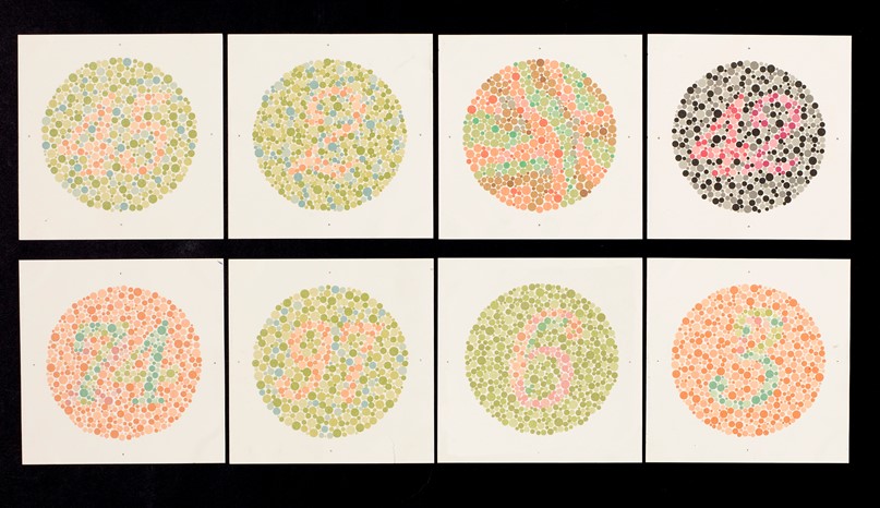
Door: A door used for environmental decal and repaint interactions.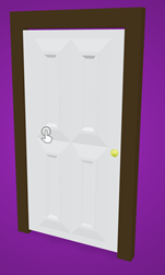
Chair: A chair used for environmental decal and repaint interactions.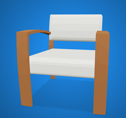
Table: A table used for environmental decal and repaint interactions.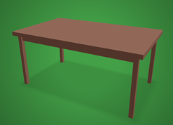
Curtains: A set curtains used for environmental decal and repaint interactions.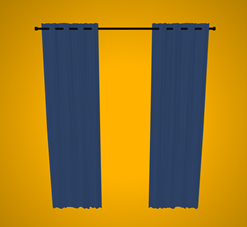
Desk: A desk used for environmental decal and repaint interactions.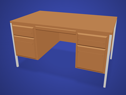
Conclusion
We designed a VR application that encourages CVD-aware colour schemes by exposing designers to the lived reality of people with CVD. Our application design tries to strike a balance between intuitiveness and convenience, at the expense of depth of features. A fully featured implementation for industry use would incorporate the features we outlined in the interaction design and technical implementation sections. The next step is to undergo usability testing of our core interactions to verify the assumptions we’ve made about their intuitiveness and suitability for a design-centric workflow.
Authors
Toby Coy (603076)
Brayden Ransom-Frost (516971)
Joey Nicholas (497877)
Jasper Lennaen (576055)
Delaney Roach (454429)
References
Alrubail, R., 2015. Teaching Empathy Through Design Thinking. [online] Edutopia. Available at: <https: www.edutopia.org="" blog="" teaching-empathy-through-design-thinking-rusul-alrubail#:~:text="Empathy%20is%20the%20first%20step%20in%20design%20thinking%20because%20it,problem%2C%20circumstance%2C%20or%20situation."> [Accessed 6 October 2022]. </https:>
Asada, K. (2019) Chromatic Vision Simulator. Available at: https://asada.website/cvsimulator/e/.
Bigman, A., 2011. Why all designers need to understand color blindness. [online] 99designs. Available at: <https: 99designs.com.au="" blog="" tips="" designers-need-to-understand-color-blindness=""> [Accessed 6 October 2022]. </https:>
Chaparro, A. and Chaparro, M., 2016. Applications of Color in Design for Color-Deficient Users. Ergonomics in Design: The Quarterly of Human Factors Applications, [online] 25(1), pp.23-30. Available at: <https: journals-sagepub-com.ezproxy.utas.edu.au="" doi="" pdf="" 10.1177="" 1064804616635382="">. </https:>
Collinge, R., 2017. How to Design for Color Blindness. [online] Getfeedback.com. Available at: <https: www.getfeedback.com="" resources="" ux="" how-to-design-for-color-blindness=""> [Accessed 6 October 2022]. </https:>
Eschbach, R., 2020. How colour‐deficient observers see things, or not. Coloration Technology, [online] 137(1), pp.29-32. Available at: <https: onlinelibrary.wiley.com="" doi="" full="" 10.1111="" cote.12494="">. </https:>
Fickett, M., 2022. Color Universal Design and Architecture - Payette. [online] Payette. Available at: <https: web.archive.org="" web="" 20220202000755="" https:="" www.payette.com="" cool-stuff="" color-universal-design-and-architecture=""> [Accessed 6 October 2022]. </https:>
Lee, H., Lee, E. and Choi, G., 2020. Wayfinding Signage for People with Color Blindness. Journal of Interior Design, [online] 45(2), pp.35-54. Available at: <https: onlinelibrary.wiley.com="" doi="" full="" 10.1111="" joid.12169="">. </https:>
Schutte, N. and Stilinović, E., 2017. Facilitating empathy through virtual reality. Motivation and Emotion, [online] 41(6), pp.708-712. Available at: <https: link.springer.com="" article="" 10.1007="" s11031-017-9641-7="">. </https:>
Wu, F., Tseng, C. and Cheng, C., 2019. The composition of visual texture design on surface for color vision deficiency (CVD). Computers in Human Behavior, [online] 91, pp.84-96. Available at: <https: www.sciencedirect.com="" science="" article="" pii="" s0747563218300864="">. </https:>
www.colorjack.com 2022. Color Blindness Simulation. [online] Available at: <https: web.archive.org="" web="" 20081014161121="" http:="" www.colorjack.com="" labs="" colormatrix=""> [Accessed 6 October 2022]. </https:>
<https: web.archive.org="" web="" 20081014161121="" http:="" www.colorjack.com="" labs="" colormatrix=""></https:>
Models
Glasses by Jeremy [CC-BY] (https://creativecommons.org/licenses/by/3.0/) via Poly Pizza (https://poly.pizza/m/9i5mmOwt7cu)
Colour-blindness tests: (https://commons.wikimedia.org/wiki/File:Eight_Ishihara_charts_for_testing_colour_blindness,_Europe_Wellcome_L0059163.jpg)
Door by Poly by Google [CC-BY] (https://creativecommons.org/licenses/by/3.0/) via Poly Pizza (https://poly.pizza/m/9ElP4aKTczP)
Chair by CMHT Oculus [CC-BY] (https://creativecommons.org/licenses/by/3.0/) via Poly Pizza (https://poly.pizza/m/aVo4dG09vfD)
Table by Hunter Paramore [CC-BY] (https://creativecommons.org/licenses/by/3.0/) via Poly Pizza (https://poly.pizza/m/7qAyGZnerYt)
Curtains by Poly by Google [CC-BY] (https://creativecommons.org/licenses/by/3.0/) via Poly Pizza (https://poly.pizza/m/9bI1TGwmvzD)
Desk by CMHT Oculus [CC-BY] (https://creativecommons.org/licenses/by/3.0/) via Poly Pizza (https://poly.pizza/m/7ban171PzCS)
<https: web.archive.org="" web="" 20081014161121="" http:="" www.colorjack.com="" labs="" colormatrix=""></https:>
<https: web.archive.org="" web="" 20081014161121="" http:="" www.colorjack.com="" labs="" colormatrix=""></https:>
Leave a comment
Log in with itch.io to leave a comment.