Assignment 5 Report - What Does Christmas Look Like Final Prototype


Introduction
Colour Vision Deficiency (CVD) affects 1 in 12 males and 1 in 200 females (Collinge, 2017). ‘What Does Christmas Look Like’ (WDCLL) is a virtual reality (VR) application that allows colour-able designers to experience the effects of various kinds of CVD whilst editing and recolouring the virtual environment to best suit a wide range of colour-able and colour deficient people.
Design Revisions
Our original goal was to implement virtual glasses that users would wear to simulate each form of CVD. During the development process we realised that interactions that add friction to the vision switching process would only increase friction during use. As a result, we decided to cease development on the glasses and instead have incorporated suggestions obtained during our testing period to streamline vision filtering, which we will detail in the testing section below.
Technical Development
The core features of WDCLL have been implemented, including movement, changing vision modes, selecting colours, and painting the environment. The improvements since our initial prototype all focused on improving the usability of these core interactions. The implementation of our feature set is detailed below, with justification for our feature choices outlined in our response to the usability testing results at the end of the report.
Our application is still a long way from being fully featured. For our application to fill its intended niche, it will need to allow for architectural design (creating and moving objects and scenes), altering object materials, colouring sections of objects (currently entire objects must be coloured), selecting from a broader range of colours, and adjusting environmental lighting as a bare minimum.
The Paint and Filter Palettes The two primary palettes are attached to each of the player’s wrists. The left controls the colour of the paint balls, while the right dictates the current colour blindness shader applied. Each are activated using a raycast emitting from the centre of the player’s vision that collides with trigger colliders attached to the appropriate location on each hand. The UI makes use of Oculus’s provided OVRGazePointer script and objects that make use of the UI event system and raycasting to create a cursor in the centre of the user’s vision that can be used to interact with UI elements like a mouse would normally. Selected colours/modes are highlighted while active and the currently selected colour value is stored in a singleton global object that carries between scenes. Due to user feedback, a quick swap button was included for the Colour Blindness modes, allowing the user to change between modes with a button press. This functions by taking the current enum value stored by the shader script, casting it to an int and increasing it by 1 and then casting it back to the shader script. As there are only 9 shader modes (0-8) when the cast int exceeds 8, it is returned to 0 causing the list to loop.
Vision Filtering
To simulate CVD we drew heavily from a guide (www.colorjack.com, 2022) on converting red, green, and blue values to those that someone with CVD might perceive. The guide included sets of values for many types of CVD, with each set corresponding to one type of CVD. A set of values described how much of each channel should be reapplied to all three channels, and what distributions, leading to 9 values between 0 and 1. These values were then stored in a C# script, that then modifies a shader that is attached to the camera in Unity. When the user selects a CVD filter option, the camera shader is modified with the relevant channel values.
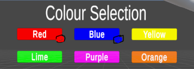
We originally designed the colour selection palette to show normal colours alongside the CVD adjusted buttons (see image below). This was supposed to be implemented with a mask texture, calculated during the render, however this proved too difficult to implement and further research into using stencil buffers did not solve the design problem either as the stencil buffer was lost between the fragment shader and the pixel-based post processing shader. Another option was to use two cameras that rendered different layers, however integration with the oculus plugin prevented this. In the end, we decided not to include the normal colours and simulate colour-blindness over the entire vision.
Fig 1: Boxes in the bottom right corner of each colour button were intended to always show the unfiltered base colour.
Painting and Aiming
The aiming reticule was developed using the code that had been implemented for the teleportation of the player, which was implemented using a script sourced from the unity asset store (Simple VR Teleporter, 2022). The key functionality of this script is that it uses a boolean (true/false) value to tell the reticule to update or not.
The updating of the reticule uses an input angle to determine how high the start of the line should be, followed by using a strength variable to change how far the reticule should go. With these, it creates a list of positions and passes that list to a line renderer, that creates the line.
It should be noted that the reticule needs to be manually adjusted using the angle and strength variables to follow the trajectory of the ball, and if the ball’s projectile strength were to change, the reticule would need to be updated.
Audio
Audio is an important aspect of user interfaces and is often overlooked. The added sensory information from sound effects can add a feeling and imagination to a scene that may not otherwise be described through visuals (Ferrington, 2016). To add sound to our interface, we used two sources of audio, one was an ambient background noise specific to the scene, designed to cement the location. The other was sound effects that play when interacting with the controls of the interface, like opening a palette or teleporting. Ideally all interactions with the virtual world, should have a matching sound effect, to better match the real world to improve feedback, mapping, and the conceptual model the user has developed.
3D Content
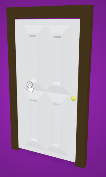
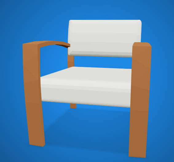
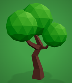
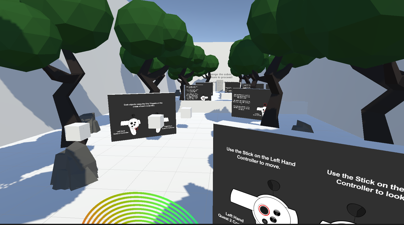
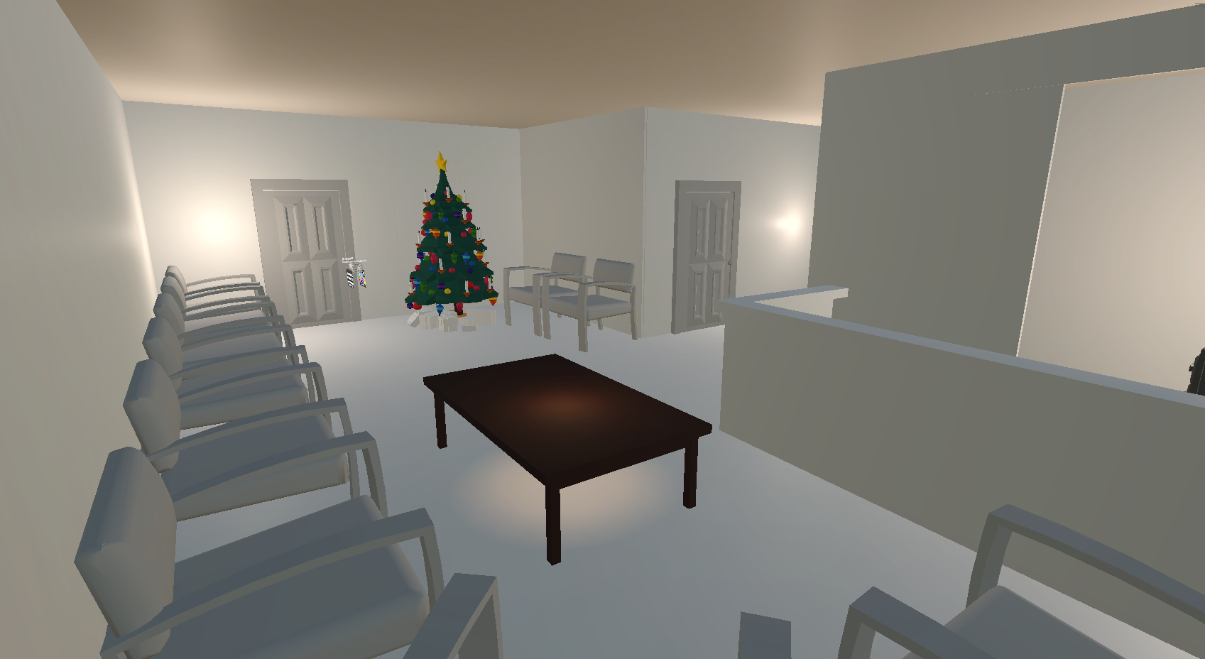
Our 3D objects were used across two areas: the tutorial room and the testing room. The tutorial room (fig 2) is a naturalistic space dotted with trees, gentle background sounds, with intentionally obtrusive and large tutorial screens that teach the user about each interaction. The testing area (fig 3) is more realistic and is intended to replicate an indoor design scenario, and thus features standard indoor furniture include chairs, doors, tables, and in the case of this waiting room, a Christmas tree.
Figure 2: The tutorial area.
Figure 3: The Testing Area
Explanation of 3D models
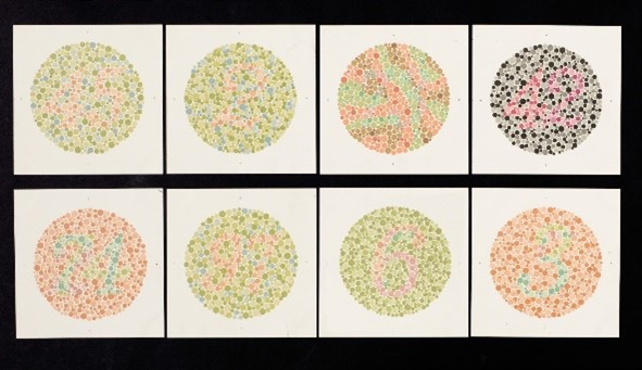
Ishihara Plates: Colour vision test plates in the tutorial area. They are used to test the filters and demonstrate common colour combination antipatterns.
Door: A door used for environmental decal and repaint interactions.

Chair: A chair used for environmental decal and repaint interactions.

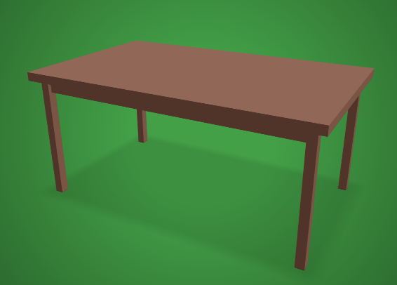
Table: A table used for environmental decal and repaint interactions.
Curtains: A set curtains used for environmental decal and repaint interactions.

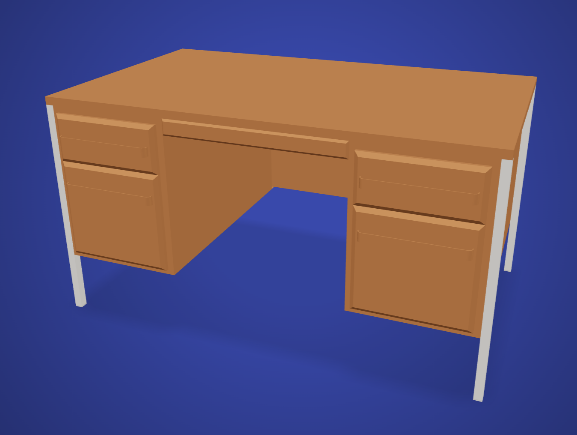
Desk: A desk used for environmental decal and repaint interactions.
Tree: A tree used for environmental decal and repaint interactions.

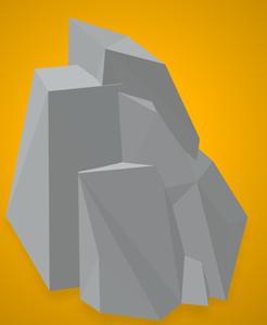
Rock: A rock used for environmental decal and repaint interactions.

Christmas Tree: An unpaintable Christmas tree for decoration and to showcase the CVD filter effects.

Usability Testing
Design and Plan
We designed an initial round of usability tests to determine the intuitiveness of our interactions, and to establish average times to complete the core task of comparing environmental colour combinations. These task times are intended to be used in future analysis comparing the efficiency of our application against standard interfaces such as mouse and keyboard, and as an internal benchmark to determine whether future changes to the application truly improve its usability.
Testers assumed the persona of an interior designer working on a medical waiting room. We constructed user stories for vision filtering and painting (see figure 4), including a final task in which testers utilised the previous interactions to design a simple environment composition that was distinguishable for all forms of CVD. Because the method of selecting paint colour is identical to changing the CVD filter, we treated vision filtering as a menu interaction story as well.
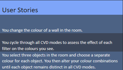
Figure 4: test session user stories.
Recruitment
ICT students and staff in a virtual and augmented reality unit at the University of Tasmania were recruited to serve as test subjects. All participants were familiar with VR, which resulted in a biased testing sample.
Testing Protocol
Each testing session took approximately 10 minutes and was conducted in a computer lab containing fewer than 10 other students. Users completed an in-app tutorial prior to beginning the testing session. Verbal instructions were given for each task. Upon completion, and before beginning the next task, the participant was asked to rate the intuitiveness of the interaction on a 1-10 Likert scale, and then prompted to give open-ended feedback about the ease of that interaction. The final task was also timed.
Results and Analysis
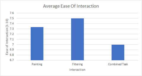
Fig 5: Chart of average scores for the ease of each task, with 10 being extremely easy and 1 being not easy at all.
Tutorial Room
Every participant failed to spot the table containing Ishihara plates, which existed to help them test different vision modes and to prime them on common problematic colour combinations.
Painting
On average participants rated painting as very intuitive (7.33). Firing paint was described as ‘fun’ and ‘easy’. In the open-ended feedback, testers pointed out that the inability to quickly undo mistakes, and the lack of an aiming reticule both impaired the ease of the interaction.
Menu Interaction / Filter Changing
This was rated as the most intuitive of the tested interactions, with an average ease of usability rating of 7.5 (very intuitive). Feedback mentioned that the menu buttons were unnecessarily small relative to the palette size. Another tester pointed out that they didn't know the technical names of each filter, and thus had to test each filter to figure out what it did. Finally, the need to look at the filter palette at all was questioned – testers said that a button to cycle through filters would allow them to continue looking around the environment without looking at the menu.
Combined Task
The combined task received the lowest usability rating at 7. It took participants 105 seconds on average to complete the task. Two thirds of testers adopted the strategy of holding up both arm menus, and repeatedly selecting a new filter before looking at the effect on the full range of colours on display on the colour picker. One tester found this to be efficient, while another mentioned that it was ‘very tiring’ for their arms, and the last tester pointed out that a simple button to cycle between filters would eliminate the need to continue consulting the filter menu throughout the task.
The inclusion of the monochromacy filter added substantial difficulty – with all colours appearing a different shade of grey, participants were forced to select colours based on their lightness. Participants settled on a colour combination that worked for most CVD filters very quickly, and then spent longer attempting to find a solution that also worked with monochromacy.
We expect the time taken for the task to reduce as we implement the usability feedback given by our testers. Without a baseline workflow to compare to, it is difficult to judge whether participants completed the task quickly. Testing for time reduction, and comparing these values with other applications, would be a good target for future usability testing.
Addressing the Results
In response to the feedback we replaced the scientific CVD labels on the vision filter with plain language descriptions. Next, we implemented a quick swap button to cycle to the next filtering mode and remove the need to continually consult the filter menu. To help users know in advance whether their aim is on target, we implemented an aiming reticle and appears when the user holds down the trigger button. We changed the layout of the tutorial room to make the table of Ishihara plates more visible. Finally, we increased the size of the menu buttons to make colour and filter selection less error prone.
References
Alrubail, R., 2015. Teaching Empathy Through Design Thinking. [online] Edutopia. Available at: <https: www.edutopia.org="" blog="" teaching-empathy-through-design-thinking-rusul-alrubail#:~:text="Empathy%20is%20the%20first%20step%20in%20design%20thinking%20because%20it,problem%2C%20circumstance%2C%20or%20situation."> [Accessed 6 October 2022].</https:>
Asada, K. (2019) Chromatic Vision Simulator. Available at: https://asada.website/cvsimulator/e/.
Bigman, A., 2011. Why all designers need to understand color blindness. [online] 99designs. Available at: <https: 99designs.com.au="" blog="" tips="" designers-need-to-understand-color-blindness=""> [Accessed 6 October 2022].</https:>
Chaparro, A. and Chaparro, M., 2016. Applications of Color in Design for Color-Deficient Users. Ergonomics in Design: The Quarterly of Human Factors Applications, [online] 25(1), pp.23-30. Available at: <https: journals-sagepub-com.ezproxy.utas.edu.au="" doi="" pdf="" 10.1177="" 1064804616635382="">.</https:>
Collinge, R., 2017. How to Design for Color Blindness. [online] Getfeedback.com. Available at: <https: www.getfeedback.com="" resources="" ux="" how-to-design-for-color-blindness=""> [Accessed 6 October 2022].</https:>
Eschbach, R., 2020. How colour‐deficient observers see things, or not. Coloration Technology, [online] 137(1), pp.29-32. Available at: <https: onlinelibrary.wiley.com="" doi="" full="" 10.1111="" cote.12494="">. </https:>
Ferrington, G., 2016. Audio Design: Creating Multi-Sensory Images For the Mind. Jornal of Visual Literacy, 14(1), pp. 61-67.
Fickett, M., 2022. Color Universal Design and Architecture - Payette. [online] Payette. Available at: <https: web.archive.org="" web="" 20220202000755="" https:="" www.payette.com="" cool-stuff="" color-universal-design-and-architecture=""> [Accessed 6 October 2022].</https:>
Lee, H., Lee, E. and Choi, G., 2020. Wayfinding Signage for People with Color Blindness. Journal of Interior Design, [online] 45(2), pp.35-54. Available at: <https: onlinelibrary.wiley.com="" doi="" full="" 10.1111="" joid.12169="">.</https:>
Schutte, N. and Stilinović, E., 2017. Facilitating empathy through virtual reality. Motivation and Emotion, [online] 41(6), pp.708-712. Available at: <https: link.springer.com="" article="" 10.1007="" s11031-017-9641-7="">.</https:>
Wu, F., Tseng, C. and Cheng, C., 2019. The composition of visual texture design on surface for color vision deficiency (CVD). Computers in Human Behavior, [online] 91, pp.84-96. Available at: <https: www.sciencedirect.com="" science="" article="" pii="" s0747563218300864="">.</https:>
www.colorjack.com 2022. Color Blindness Simulation. [online] Available at: <https: web.archive.org="" web="" 20081014161121="" http:="" www.colorjack.com="" labs="" colormatrix=""> [Accessed 6 October 2022].</https:>
Simple VR Teleporter | Input Management | Unity Asset Store I Jemin, assetstore.unity.com, viewed 27 October 2022, <https: assetstore.unity.com="" packages="" tools="" input-management="" simple-vr-teleporter-115996="">.</https:>
Assets
Colour-blindness tests: (https://commons.wikimedia.org/wiki/File:Eight_Ishihara_charts_for_testing_colour_blindness,_Europe_Wellcome_L0059163.jpg)
Door by Poly by Google [CC-BY] (https://creativecommons.org/licenses/by/3.0/) via Poly Pizza (https://poly.pizza/m/9ElP4aKTczP)
Chair by CMHT Oculus [CC-BY] (https://creativecommons.org/licenses/by/3.0/) via Poly Pizza (https://poly.pizza/m/aVo4dG09vfD)
Table by Hunter Paramore [CC-BY] (https://creativecommons.org/licenses/by/3.0/) via Poly Pizza (https://poly.pizza/m/7qAyGZnerYt)
Curtains by Poly by Google [CC-BY] (https://creativecommons.org/licenses/by/3.0/) via Poly Pizza (https://poly.pizza/m/9bI1TGwmvzD)
Desk by CMHT Oculus [CC-BY] (https://creativecommons.org/licenses/by/3.0/) via Poly Pizza (https://poly.pizza/m/7ban171PzCS)
Christmas Tree by Don Carson [CC-BY] (https://creativecommons.org/licenses/by/3.0/) via Poly Pizza (https://poly.pizza/m/exL-ilJKlZt)
Tree by ParfaitUwU [CC-BY] (https://creativecommons.org/licenses/by/3.0/) via Poly Pizza (https://poly.pizza/m/MSuchZNT2G)
Rock by Danni Bittman [CC-BY] (https://creativecommons.org/licenses/by/3.0/) via Poly Pizza (https://poly.pizza/m/4TpBWdzKDf2)
Sound effects by freesfx.co.uk
Leave a comment
Log in with itch.io to leave a comment.